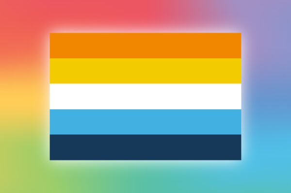

Among the tapestry of vibrant flags that colour the LGBTQIA+ community, the Genderfluid Pride Flag stands out with its unique spectrum. But what does it represent, and how did it come to be?
Designed in 2012 by JJ Poole, the flag boasts five horizontal stripes, each imbued with a powerful meaning:
- Pink: Representing femininity, pink acknowledges the presence of female identity within the genderfluid spectrum.
- Blue: As a symbol of masculinity, blue honours the male aspect of genderfluid experiences.
- Purple: A beautiful blend of pink and blue, purple celebrates the fluidity and combination of both feminine and masculine identities. It stands for those who may feel both, neither, or somewhere in between.
- White: Encompassing agender or gender-neutral identities, white acknowledges the absence of a specific gender identity within the spectrum.
- Black: Representing all genders beyond the binary, black is a powerful symbol of inclusivity, embracing non-binary identities, third genders, and pangender experiences.
The Genderfluid Pride Flag is more than just a symbol; it’s a vibrant declaration of existence, a celebration of the rich tapestry of gender identities that exist outside the binary. It’s a beacon of acceptance and understanding, reminding us that gender is a spectrum, not a set of boxes.
Here at Rainbow Republic, we’re proud to offer the Genderfluid Pride Flag in various forms, from bandanas and t-shirts to phone cases and mugs. By displaying these symbols, we can all contribute to creating a more inclusive and understanding world, where everyone feels celebrated for who they truly are.